Poster Boy
Ask Erik Ries what it’s like to make movie posters for a living and he’ll say it’s not just about movies. In fact, “making movie posters” isn’t even the right way to describe it.
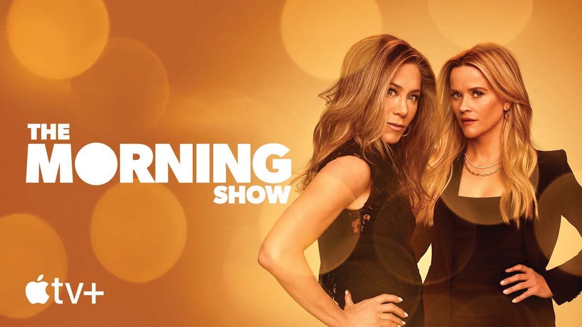
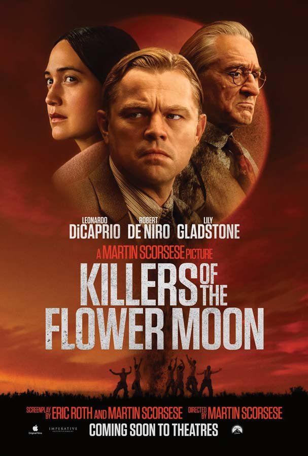
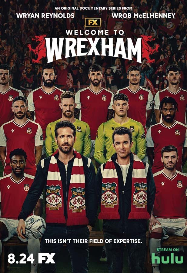
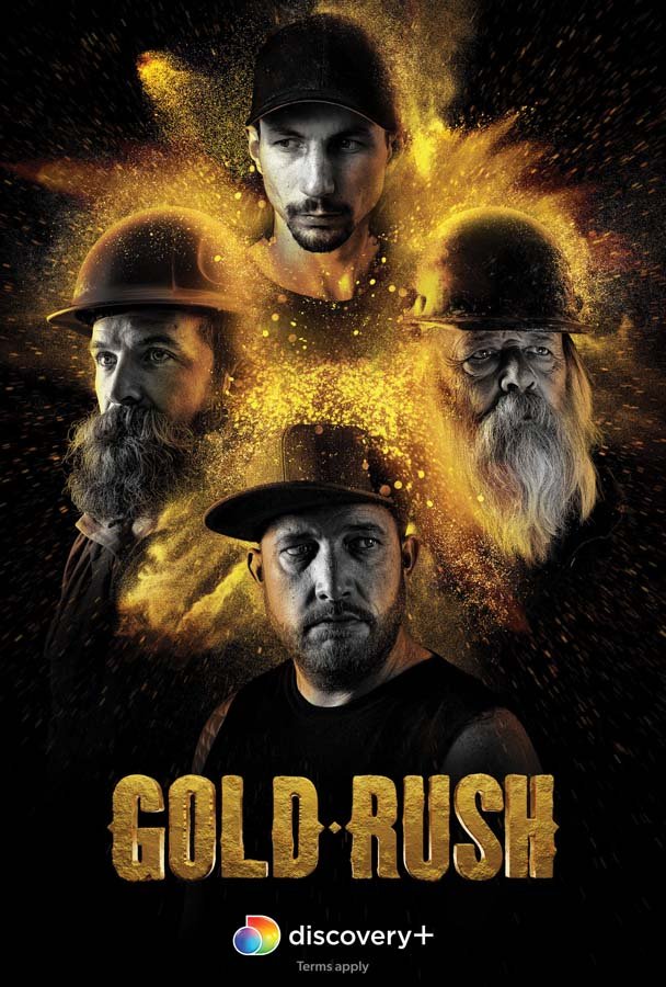
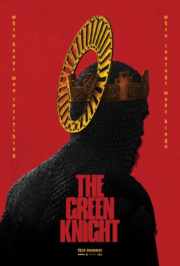
Technically, Ries works in the field of entertainment advertising. His projects range from Hollywood blockbusters — for instance, Killers of the Flower Moon, Dunkirk, Jordan Peele’s Nope, and tentpole franchises, such as the Star Wars, Fast & Furious and Mission: Impossible movies — to award-winning television shows, including Apple TV’s The Morning Show, Paramount’s Yellowstone, HBO’s Euphoria, Succession, Game of Thrones and countless others.
Ries will also tell you it’s not all posters either. Actually it’s “marketing collateral,” which means he helps design everything from subway banners in New York City to billboards overlooking Los Angeles. Plus magazine advertisements, web campaigns, images for social media, you name it. “When it comes to marketing a movie, a poster is just one piece among thousands of other moving pieces. Realistically, I’m not even sure why movie posters are 27 inches by 40 inches tall anymore. Everybody streams everything horizontally on their phones, tablets, or TVs, which is a 16-by-9 widescreen aspect ratio…” Ries says, thinking aloud.
Ries is a complicated guy. But that’s perfect because he works in a complicated industry.
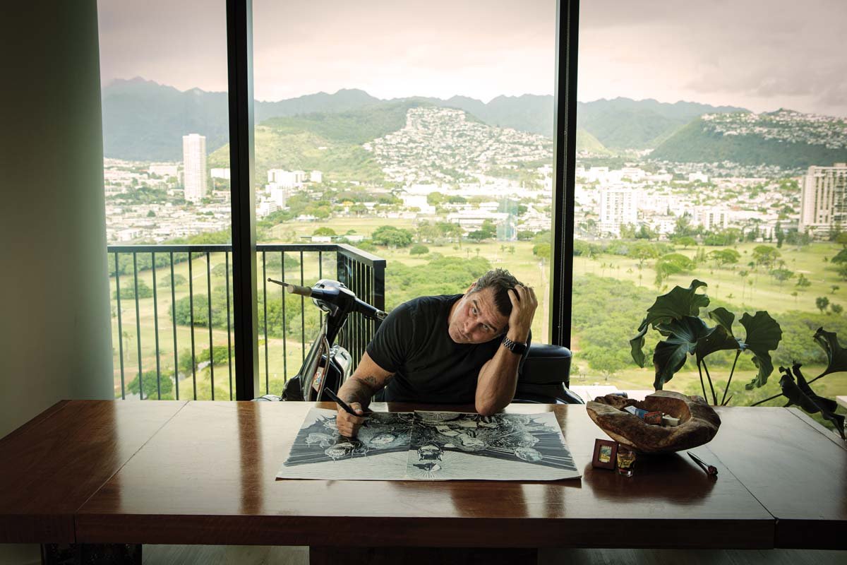
Let’s start from the beginning: Erik Ries helps design key art for the entertainment industry. He lives in Waikiki but works remotely as a senior art director at Lindeman & Associates (LA for short), a creative advertising agency in Los Angeles (LA for short) that Ries describes as being the best in the business.
Think of key art as an iconic visual that defines a piece of media: Imagine Tom Hanks sitting on a park bench in Forrest Gump. Or Jodie Foster with a moth covering her mouth for Silence of the Lambs. (Is it even possible to see a DeLorean without thinking of Back to the Future? Or to picture a great white shark without remembering the first time you saw Jaws?)
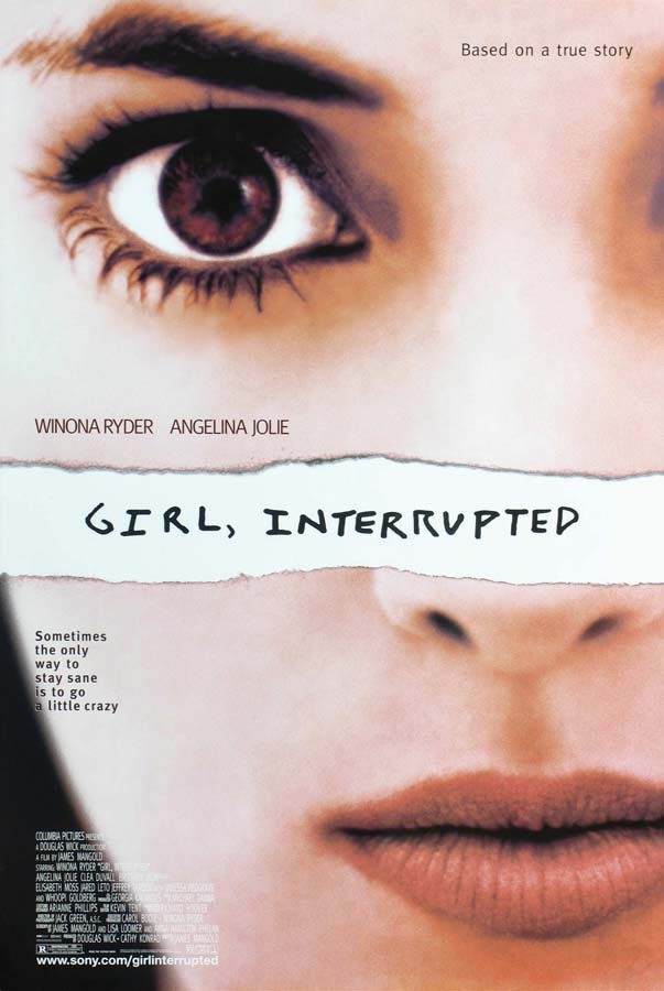
Ideally, good key art should capture the essence of a story in a striking, memorable way. It may include the title, like the red-and-black logo for Jurassic Park, or the puppet strings holding up the letters of The Godfather, or the close-up of Winona Ryder’s face with the photo torn in half from Girl, Interrupted — this last one Ries actually came up with.
“The story is about a woman who goes to a mental institution. So the idea is that she’s writing in her journal and the page is torn across the middle,” he says. “She’s a girl literally interrupted by type.” While brainstorming design ideas for Girl, Interrupted in the late ’90s, Ries hand ripped a photocopied image and scribbled “Girl, Interrupted” on the front. This concept became the de facto image for the movie. It was later nominated for a Clio Award, basically the Oscars of the advertising world.
At the time, Ries was in his first year at Pratt Institute for a master’s in communication design and was only a few months into his first job at a creative agency. “Even just being nominated [for a Clio] was like placing in the Kentucky Derby right out of the gate,” says Ries. “Of course, that became the ongoing joke in that company. Every time I pitched an idea, everyone asked me: ‘Was your concept interrupted by type?’”
Twenty-five years in, Ries estimates he’s worked on more than 2,000 movies and shows conservatively. No two projects are alike, but the design process does have a trajectory: It begins with a kickoff where Ries and the rest of the design team first receive a creative overview about the project. “Sometimes it’s a movie trailer and a full press kit, sometimes it’s just a two-line synopsis of what the movie is about,” he says.
Next, they’ll research the world of the story. What is the plot? Where is the story set? Who is the intended audience? What is the time period? For Martin Scorsese’s Killers of the Flower Moon, the title refers to a series of murders committed against the Osage Nation in Oklahoma during a flower moon, which is the first full moon in May and represents the blooming of spring flowers. Ries and the LA team studied which flowers were endemic to Oklahoma in the early 1920s when the murders took place.
Does this necessarily mean there will be flowers in the poster? Maybe. Maybe not. The final decision is up to the film studios. But it’s Ries’ responsibility to go the distance; the period-specific flowers become another tool in his arsenal as he compiles his collection of reference media and digital assets (like thousands of photos of Robert De Niro, Leonardo DiCaprio, and Lily Gladstone).
“Everything has meaning. There could be 100 photos of a character looking over her shoulder that look nearly identical. But if her gaze is slightly up or slightly down, she might look more hopeful or more despondent. That’s huge,” Ries says.
Another factor is time. Ries and the LA team might be working on a project for a week, a month, a year or longer. It isn’t unusual for a massive flick to take upwards of three years with thousands of pieces of concept art being submitted to studios for consideration.
“Once they stop asking for updates, it means the art might be ready enough to finalize and release. If I don’t hear anything, I move onto the next project,” says Ries, who often works on 12 to 24 different movies or shows at a time. “Hollywood is the only industry I’ve encountered where nobody knows what the next day will look like. I can go to bed with my schedule ready for tomorrow, then when I wake up, everything changes because a movie gets canceled, or the agency signs a new client… Anything can happen.”
Ries loves making movie posters for a living. (Er, creating entertainment advertising for a living.) Even if juggling projects and needing to turn on a dime can be exhausting at times. Even if most people don’t understand all the design intricacies happening behind the scenes.
“When I first got into the industry, I went back to my hometown of Philomath, Oregon, to see my family for the holidays. My mom and I go to rent a movie at a video store — this is before DVDs — and she picks a VHS and says, ‘this looks good.’ My mom doesn’t know who’s in the movie or what it’s about. So I ask her why she picked that one. She says the way the cover looks and how it’s designed; it gives her a good feeling,” Ries says. “I remember being in that moment and thinking: This thing that I do actually makes a difference.”